What are the best fonts for a website?
-
Abdul Wadood
There are several fonts available. Among them, you should choose a font that suits the characteristics of your website.
However, if you’re a beginner, you’ll probably be confused about what font to choose.
If you’re in such a situation, don’t worry!
In this blog, I have made a list of the best fonts for a website.
Let’s get started!
Topics to be covered in this blog:
Why is it essential to use the correct font?
If you want visitors to read your content, the font should be legible and pleasing to their eyes.
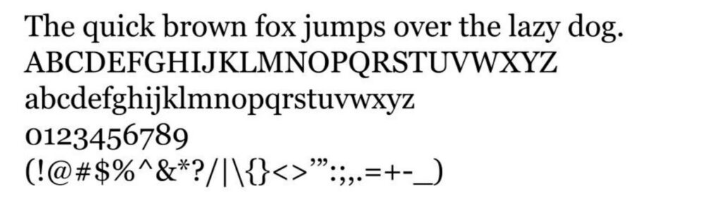
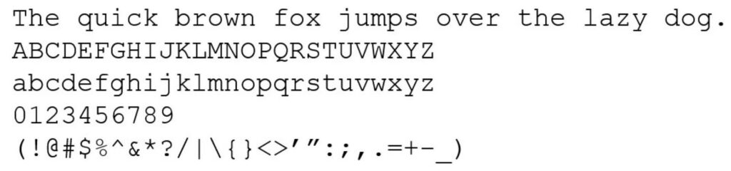
Will you read content if it has a font similar to the ones seen in the image below?

Most probably, no. Do you agree with me?
I recommend using a simple font as it’s more legible. However, some people tend to focus more on the font’s style over its legibility.
A fancy font may look good. But, the users will have a hard time reading them. So, there’s a high chance for the users to leave your website, which negatively affects the SEO performance.
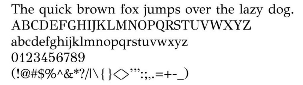
Here’s an example of a font that Wikipedia has used in its article.
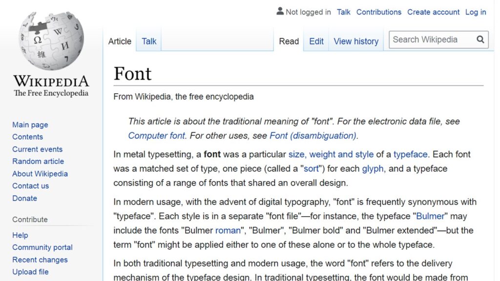
As you can see, the font is simple and easy to read.
Before moving on to the next topic, I would like to make a note of a point.
A font may not directly affect the SEO performance of your website. However, it does affect the performance indirectly.
If you opt for a good font, people will stay on your website longer because the content will be easier to read. This signals to Google that your content is worth ranking high in the search results.
However, if you use a hard-to-read font, people won’t read your content and leave your website. This will increase the bounce rate, signaling to Google that people aren’t interested in reading your content.
How to create a fallback font?
A fallback font is a font that will replace your primary font if it isn’t available or fails to load.
Here’s an example.
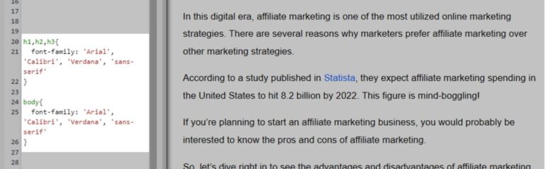
In this case, Arial is my primary font for both heading and body.
If Arial isn’t available or fails to load, the web browser will try loading Calibri.
If Calibri also doesn’t load, the web browser will try loading Verdana.
If Verdana also fails to load (imaginary situation), the web browser will display font from the sans-serif family.
As a webmaster, you shouldn’t rely on a single font as there’s a chance for it to be unavailable. If such a situation arises, your visitors will end up seeing a font different from what you’d expect them to see.
Tip: To give your visitors the closest reading experience when your primary font fails to load, choose a fallback font that belongs to the same family. For instance, if your primary font is Arial, you can use Calibri and Verdana as the fallback font because they belong to the same sans-serif family.
15 best web-safe fonts for a website
Web-safe fonts are the ones that all devices support. So, I highly suggest using a web-safe font on your website.
Besides using a web-safe font as the primary font, the fallback fonts also should be web-safe.
Ok.
There are five popular font types.
- Serif
- Sans-serif
- Monospace
- Cursive
- Fantasy
Though there are many font types, you should only use serif or sans-serif fonts on your website. Using other font types can make the text harder to read.
Ok.
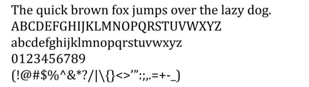
Here’s the image that indicates the difference between serif and sans-serif font.
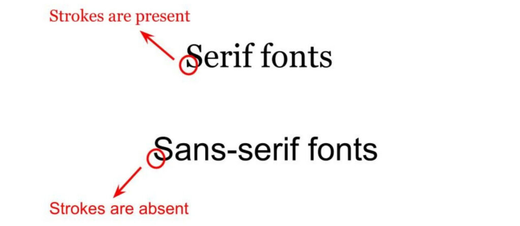
As you can see, the serif fonts have a small line (strokes) attached at the end of a letter. On the other hand, sans-serif fonts don’t have them.
Now, let’s get into the list of the best web-safe fonts for a website.
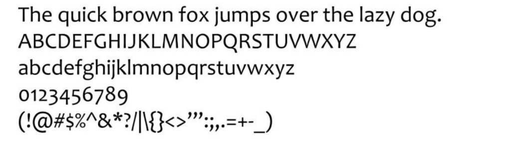
1. Georgia
Georgia is a serif font that Matthew Carter designed in 1933. The font is easy to read and has an elegant appearance.
I personally like the Georgia font and have previously used it in my blogs.
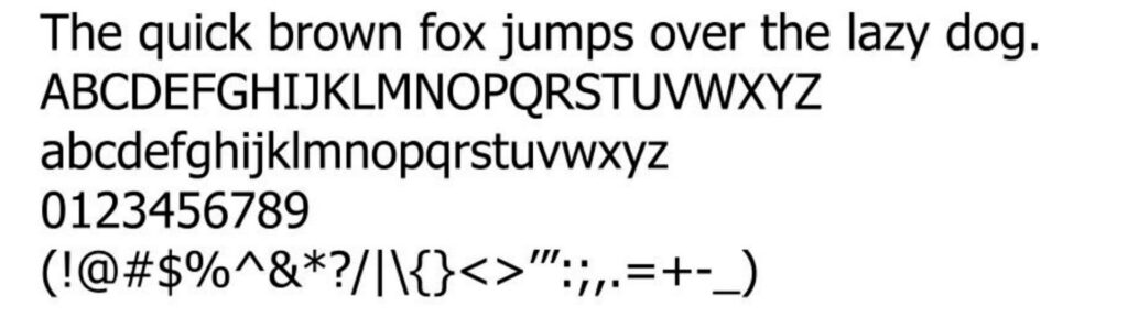
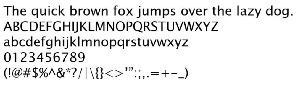
2. Arial
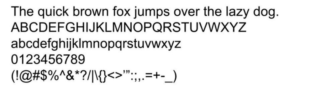
Arial is a type of sans-serif font. The font is extremely popular, and many websites use this font — including Amazon.
Arial font was founded by Robin Nicholas and Patricia Saunders in 1982. It’s a simple and easy-to-read font. Also, the font has a professional appearance.
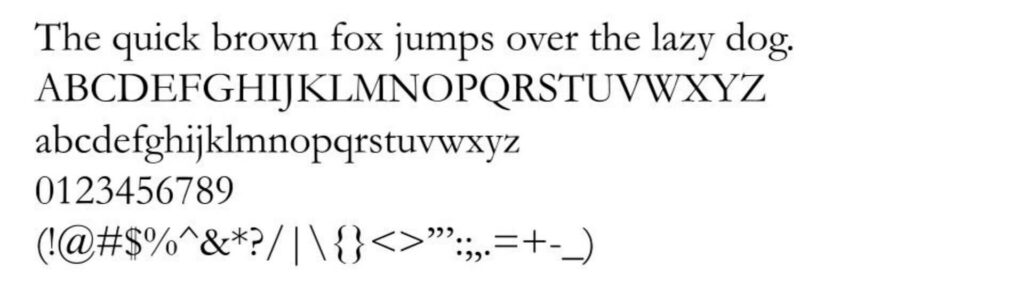
3. Times New Roman
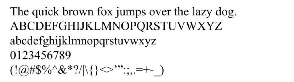
Times New Roman is a serif font that’s suitable for almost all kinds of websites.
Times New Roman font was initially designed for British newspapers by Stanley Morison. However, due to the font’s simplicity and appearance, many websites started to use it.
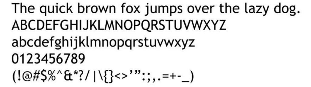
4. Verdana
Verdana is a popular sans-serif font founded by Mathew Carter in 1996.
Verdana font has a massive appearance, making it legible to almost everyone.
Companies like IKEA are using this font on their website.
5. Calibri
Calibri is a sans-serif font that was launched petty recently in 2007. The font was founded by Lucas de Groot and released along with Microsoft Office 2007.
Calibri is a simple, clean-looking, and easy-to-read font. Also, the font is pretty popular.
6. Candara
Candara is a sans-serif font that was released along with Windows Vista, created by Gary Munch.
Candara font has spacing mostly similar to Calibri, but its curvy nature gives it a character and an elegant appearance.
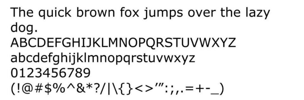
7. Tahoma
Tahoma is a sans-serif font created by Matthew Carter and was released along with Windows 95.
Tahoma was created mainly for digital purposes. This means the font will be fantastic for use on a website.
8. Garamond
Garamond is a serif font. It’s one of the oldest fonts mentioned on this list, but it gets the job done.
In the early days, Garamond font was primarily used for printing.
However, the simple and elegant appearance of the Garamond font makes it suitable for usage on websites as well.
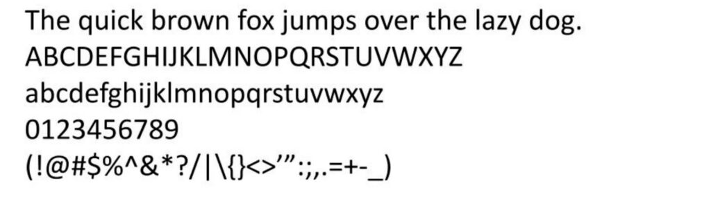
9. Trebuchet MS
Trebuchet MS is a sans-serif font that was released in 1996. Vincent Connare was the founder of the font.
Trebuchet MS is one of the most popular fonts for websites regardless of the themes you use.
10. Didot
Didot is a serif font that’s quite popular.
Though Didot may seem slightly thin compared to other serif fonts on this list, it has a classy and elegant appearance.
Didot font was created long back (1784), but still, many people use it. This proves that Didot is a great font.
11. American Typewriter
American Typewriter is a serif font, which, as the name suggests, resembles typewriter font. It was created by Joel Kaden and Tony Stan in 1974.
American Typewriter font has a unique appearance. Also, the font is readable.
12. Helvetica
Helvetica is a sans-serif font that was released in 1957.
Helvetica is a popular font, and it has a clean and elegant look.
Helvetica font is a fantastic choice for websites because of the legibility of the letters.
13. Cambria
Cambria is a pretty popular serif font that looks great and is also legible.
I personally don’t use a serif font for the body of my content. However, if you like using a serif font for the body, you can consider Cambria as the font looks great.
14. Lucida Sans Unicode
Lucida Sans Unicode is a popular sans-serif font. It was founded by Kris Holmes and Charles Bigelow in 1993.
Lucida Sans Unicode comes pre-installed on all recent versions of Windows. The Mac equivalent of this font is Lucida Grande.
Lucida Sans Unicode, like other sans-serif fonts on this list, is easily readable.
15. Palatino

Last but not least, we have Palatino, a serif font.
Palatino was released in 1949, and even now, it remains a popular font.
The reason for the popularity of Palatino includes its large size, which makes it easily readable for people.
Conclusion
Some people tend to spend a lot of time selecting a font, which is wrong.
Sure, using a good font is essential for a good user experience. However, attracting traffic to your website is even more important.
All fonts mentioned in this blog are suitable for any website. You can go through the list and choose the font you like the most.
I hope you found this blog beneficial. If you have any comments or questions regarding fonts, let’s discuss them below.
