The Ultimate Mobile SEO Checklist: Are You Missing Any?
-
Abdul Wadood

Hey there, are you optimizing your website for mobile search? If not, you could be missing out on a huge opportunity. More than half of all web traffic now comes from mobile devices, so if your site isn’t mobile-friendly, Google is less likely to rank it in the search results. The good news is, optimizing for mobile search, also known as mobile SEO, isn’t too difficult.
There are just a few key things you need to check to make sure your site is set up properly. We’ve put together the ultimate mobile SEO checklist so you can double-check that you’ve got all your bases covered. Read through and see if there are any important items you’ve been missing. Getting mobile SEO right could give your traffic and rankings a serious boost.
Table of Contents:
Audit Your Site's Mobile Friendliness
To make sure your site is optimized for mobile, you need to audit how it appears on smartphones and tablets.
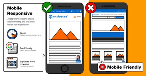
Check that your site is mobile-friendly
Google wants to provide the best experience for mobile users, so if your site isn’t optimized for mobile devices, it will rank lower in search results. The good news is, making your site mobile-friendly is pretty straightforward these days.
Use Google’s Mobile-Friendly Test to check if your site passes. If not, you’ll need to make some changes to the content and layout. Things like too much text crammed onto the page, tiny tap targets like buttons, and clunky navigation can make a site tough to use on mobile.
Ensure fast load times
Even a few extra seconds of load time on mobile can lead to poor user experience and hurt your rankings. Use a tool like Google’s PageSpeed Insights to check your mobile load speed and get recommendations to speed things up. Compressing images, minimizing redirects, and optimizing code are all effective ways to boost your mobile performance.
Make browsing and buying easy
If you have an e-commerce site, make the mobile shopping experience seamless. Have large product images, clear calls-to-action, and a streamlined checkout process. Let users save items for later or share them on social media. Offer conveniences like 1-click purchasing and guest checkout.
Keeping your mobile SEO in check is key to reaching today’s on-the-go users. By optimizing for mobile devices, you’ll drive more organic traffic, increase dwell time, and boost those all-important conversions. Now isn’t that worth the effort?
Optimize Your Site Speed on Mobile

To rank well in mobile search, speed is key. If your site loads slowly on phones, Google will downgrade your rankings. Follow these tips to optimize your mobile site speed:
Check your page load time
Aim for under 3 seconds. Use a tool like Google’s PageSpeed Insights or Pingdom to check your mobile load time. Anything over 5-6 seconds needs improvement.
Reduce image sizes
Images are the biggest culprit for slow mobile sites. Compress and resize images to under 100KB. Use next-gen formats like WebP that load faster.
Minify CSS and JavaScript
Minification removes whitespace and comments to shrink file sizes. Minify your CSS and JS files – it can improve load time by up to 50%!
Enable browser caching
Browser caching stores website files so they load faster on return visits. Set cache control headers to instruct browsers to cache your files for a specific time.
Remove redirects
Redirects force mobile browsers to make extra requests and load additional pages, slowing things down. Minimize redirects, especially on your mobile landing pages.
Choose a mobile-optimized theme
If you’re using a CMS like WordPress, choose a minimal, mobile-first theme. Avoid heavy frameworks and plugins that bog down mobile performance.
Test on slow networks
Connect your mobile device to a slow 3G network and test your site speed. This shows you exactly how long it takes to load for mobile users with poor connectivity – and what needs fixing!
With some TLC devoted to optimizing for mobile, your site will be lightning fast, your visitors happy, and Google very pleased. That’s the recipe for mobile SEO success!
Implement Responsive Web Design
To optimize your site for mobile users, implementing responsive web design is crucial. Responsive design adjusts your site’s layout to fit the screen of any device. Here are some tips to make your site responsive:
Use a responsive framework
Frameworks like Bootstrap, Foundation, and Gridder automatically adjust your site to different screen sizes. They’re easy to implement and do most of the responsive work for you.
Fluid layouts
Use percentages instead of fixed widths for containers and columns. This allows them to flexibly adjust to any screen width. For example, instead of setting a container width at 960px, try 90% or 95% of the viewport width.
Media queries
Media queries detect the width of the screen and apply different CSS styling accordingly. You can use them to rearrange content, hide elements, or adjust font sizes for small screens. For example:
“`css
@media (max-width: 768px) {
#sidebar {
width: 100%;
}
}
“`
This will adjust the #sidebar to 100% width for screens 768px and below.
Flexible images and media
Use max-width: 100% on images, videos, and other embedded media so they shrink to fit their containers. This prevents them from overflowing on small screens.
Mobile-friendly navigation
Use a “hamburger” menu icon to hide navigation links on small screens, revealing them in a slide-out or popup menu. This declutters your interface and provides an optimized experience for mobile users.
Tap targets
Make sure interactive elements like links, buttons, and form fields are large enough to easily tap on mobile. As a rule of thumb, aim for tap targets at least 44px x 44px in size.
Following these responsive design best practices will ensure your site provides an optimal viewing experience for users on any device. Your mobile SEO and rankings will improve as a result.
Create Mobile-Friendly Content
To rank well in mobile search, you need to create content optimized for mobile devices. Here are some tips to ensure your content is mobile-friendly:
Use Short Sentences and Paragraphs
On mobile, people tend to scan content. Keep your sentences under 20 words and paragraphs under 3 sentences. This makes your content easy to read on small screens.
Include Relevant Keywords
Use keywords and related terms relevant to your topic throughout the content. Place main keywords in headings, subheadings, and the first sentence of paragraphs. This helps search engines determine what your content is about.
Use Bulleted or Numbered Lists
Lists are skimmable and easy to read on mobile. Use them for steps, tips, examples, or key points. Each list item should be 1-2 sentences.
Include Visuals
Images, infographics, screenshots, and short videos improve the mobile experience. Place visuals close to the relevant text. Optimize visuals for mobile by keeping them under 1MB in size.
Use Clickable Headings and a “Back to Top” Link
Make it easy for mobile users to navigate your content. Turn each heading into an anchor link that jumps down the page. Include a “Back to Top” link at the end to return to the top.
Keep a Simple Design
A cluttered or complex design won’t display well on mobile. Use plenty of white space, a simple layout, and easy-to-read text. Your content should fill the whole screen without requiring scrolling sideways.
Test and Optimize
View your content on multiple mobile devices to ensure it displays properly. Make any needed adjustments to your content or design to optimize the mobile experience. Mobile SEO is an ongoing process, so continue to optimize and improve over time.
Following these best practices will help you create engaging content optimized for mobile search and the user experience. Keep your mobile visitors in mind with every piece of content you produce.
Adapt Your Link-Building Strategy for Mobile
Your standard link-building tactics need to adapt for mobile search. The links you build should point to mobile-optimized content that loads quickly on smartphones. Some things to keep in mind:
Quality over quantity
Focus on building high-quality links from authoritative, mobile-friendly sites. Don’t just blast out links from any site—make sure they’re reputable and relevant. Mobile search algorithms highly value expert, trustworthy links.
Build links to your important mobile content like those optimized landing pages you created. Links to content that isn’t mobile-friendly won’t help your rankings.
Consider local and vertical linking
Build links from locally-focused sites and industry-specific sites. Links from these niche sites signal to Google that your content is authoritative and relevant for mobile searchers in your location or industry.
Use responsive design
Ensure any sites that link to you have a responsive design. A responsive site automatically adapts to any screen size, whether desktop, tablet, or smartphone. Links from non-responsive sites won’t influence your mobile rankings since Google can’t access the content on small screens.
Focus on your mobile-friendly neighborhood
Try to build links in your local area, surrounding neighborhoods, and communities. Build location-based anchor text like “best mobile mechanic in Springfield” or “top mortgage broker for Waco homeowners.” These geo-targeted links are ideal for local mobile search.
Diversify your links
Build a mix of link types like directory listings, guest posts, profiles, and resource links. Don’t rely only on guest blogging or link directories. A diverse portfolio of high-quality links looks the most natural to search engines.
Adapting your link-building strategy for the mobile web may require some extra work, but the rewards of higher mobile search traffic and rankings will be well worth the effort. Optimizing for mobile searchers is key to online success today.
Conclusion
So there you have it, the ultimate mobile SEO checklist to make sure your site is optimized for mobile search. If you’ve made it through the list and checked off each item, congratulations – your site should be in great shape for mobile SEO and ready to rank higher in mobile search results. If not, no worries, just start working through the checklist and optimizing your site. Remember, mobile usage and search continue to grow quickly, so mobile SEO is crucial if you want to reach more visitors and customers. Keep optimizing and improving your mobile experience, and you’ll be well on your way to mobile search success.

Abdul Wadood