What is mobile-first indexing? A detailed explanation
-
Abdul Wadood
In November 2016, Google announced its plan to introduce mobile-first indexing. In December 2018, Google started to rollout out this new feature.
On July 1, 2019, Google enabled mobile-first indexing for all new websites.
In March 2021, Google has switched all websites from desktop-first to mobile-first indexing.
Alright!
But, what is mobile-first indexing? In this blog, I have provided a detailed explanation.
Topics to be covered in this blog:
What is mobile-first indexing?
Mobile-first indexing means that the Googlebot mainly looks for the mobile version of a webpage for indexing and ranking.
Previously, Google primarily considered the desktop version of the webpage for indexing. However, since the number of mobile searches has increased drastically compared to the previous years, Google introduced mobile-first indexing.
Ok.
Now, what if a webpage isn’t mobile-friendly? Won’t Google index and rank that webpage?
If a webpage isn’t mobile-friendly, Google will consider the desktop version for indexing and ranking.
However, be noted that if your webpage isn’t mobile-friendly, its ranking can take a significant hit in the search results.
How to check whether a website is mobile-friendly?
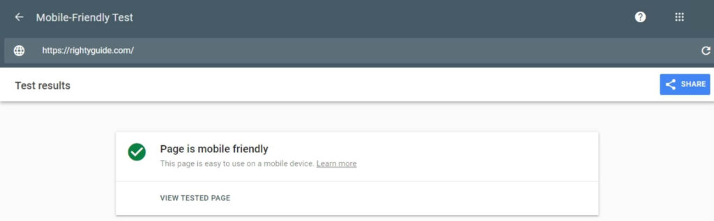
You can check the mobile-friendliness of your website using Google’s Mobile-Friendly Test tool.
Enter the URL of your website in the mobile-friendly test tool, and click “Test URL”.

If your website is mobile-friendly, you’ll get the message “Page is mobile friendly”.
If your website isn’t mobile-friendly, you’ll get the message “Page is not mobile friendly”.
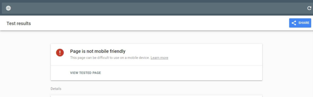
In this case, you can scroll down the page and go through the “Issues” section to get a list of the factors that affect the mobile-friendliness of your website.

If your website is mobile-friendly, you can assume that Google considered the mobile version of your website for indexing and ranking.
Mobile-first indexing best practices
Having seen the basics of mobile-first indexing, let’s now go through the list of best practices for mobile-first indexing.
1. Responsive website
Responsive web design refers to a web design approach that allows web pages to display on various devices by adapting to their screen sizes.
If you use a responsive web design on your website, your website will be automatically optimized across all types of devices.
If you’re a WordPress user, you can opt for a responsive theme to make your website optimized across all devices. Thankfully, many themes available in WordPress have a responsive design. So, if you’re a WordPress user, you don’t have to worry about responsive web design much.
2. Fast website loading speed
Nowadays, users expect a website to load fast to have a hassle-free browsing experience.
So, Google has made page loading speed a significant factor that influences the ranking of a website in search results.
Google has also incorporated page loading speed in mobile-first indexing. This was confirmed by Google’s Gary Illyes.
Ok.
You can check the loading speed of your website using Google’s PageSpeed Insights tool.
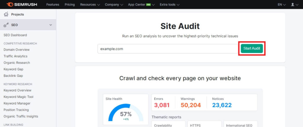
If you want more detailed analytics of your website’s loading speed, you can use SEMRush’s Site Audit tool.
To use the SEMRush Site Audit tool, you should first sign up for SEMRush. Next, you can enter your website URL and run an audit.
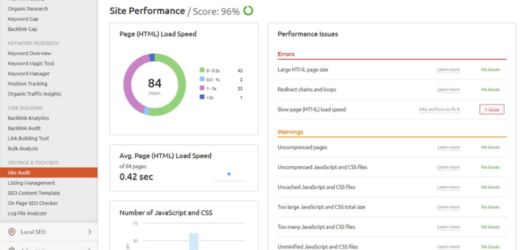
Once the auditing finishes, you can go to the site performance section to get a detailed analysis of your website’s loading speed.
Generally speaking, the faster your webpage loads, the better.
However, if your webpage has lots of resources, it’s practically not possible to make it load lightning fast. In this case, ensure that your webpage loads as fast or faster than your competitors.
Regardless of your webpage size, try optimizing it to make it load in under 3 seconds.
Here are some tips to improve the loading speed of your webpage.
- Host your website on reliable hosting platforms like HostGator.
- Minify CSS, JavaScript, and HTML.
- Compress the images before uploading them to your webpage.
- Reduce redirects.
- Use a Content Delivery Network (CDN).
3. Image optimization
The images you add to your webpage should be high-quality and should be in a supported format. The images should have sufficient resolution such that it doesn’t look too small when viewed on a mobile.
Google supports the following image formats; JPEG, PNG, GIF, BMP, WebP, and SVG.
The file size of a high-quality image will be pretty big. To reduce the image file size, you can compress it using a free tool like TinyPNG.
By compressing the image, you’re significantly reducing the file size by not sacrificing the quality much.
If you upload the images without compressing, the page loading speed can increase drastically. This can negatively affect the SEO performance and user experience.
Ok.
You should ensure that the image URL doesn’t change when the page loads. If the URL changes, Google won’t be able to index your images correctly.
If you’re adding alt text to an image, make sure it’s descriptive. Also, ensure that the alt text is similar to the desktop site.
Alt text displays to the users when an image fails to load. Moreover, alt text helps visually impaired readers using screen readers to understand an image better.
4. Avoid lazy loading primary content
When Googlebot comes to your webpage, it should be able to easily access and render the content.
If you use lazy loading for the primary content on your webpage, Googlebot won’t be able to load it.
You should note that Googlebot won’t load content that requires user interactions like swiping, clicking, or typing.
5. Use the same meta robots tags
If you want Google to crawl and index your webpage, you should use identical meta robots tags on desktop and mobile versions of your website.
Google states that if you use different meta robots tag on the mobile website (especially the noindex or nofollow tags), Google may not crawl and index your webpage when your site is enabled for mobile-first indexing.
6. Use the same structured data
If you have structured data on your website, make sure that it’s the same on both desktop and mobile sites.
You also need to make sure that the URLs in the structured data on the mobile versions are updated to the mobile URLs.
7. Desktop and mobile sites should be identical
According to Google, you should provide a similar user experience on both desktop and mobile versions of your website.
If your mobile website has less or different content than your desktop website, you should update it and ensure that the content is similar to the desktop website.
You can use a different design for your mobile site to maximize the user experience. However, the content should be the same as Google will consider the mobile version for indexing.
8. Use the same metadata
The title and meta description should be the same on both desktop and mobile versions of your website.
9. Place the promotional banners correctly
If you’re placing a banner on your webpage for promoting a product, you should ensure that it doesn’t affect the user experience for mobile users.
If you want to add a promotional banner to your webpage, I suggest placing it in the sidebar. If you do so, the banner will appear on the side for desktop users. For mobile users, the banner will appear at the bottom.
Conclusion
As you know, smartphones are more portable and convenient compared to computers. Moreover, they are fast enough to handle multiple day-to-day tasks.
So, many people started to browse the internet through their smartphones. This made Google switch from desktop-first indexing to mobile-first indexing.
As explained in this blog, mobile-first indexing means that the Googlebot will predominantly look for the mobile version of a webpage for indexing and ranking.
If your website isn’t mobile-friendly, Googlebot will consider the desktop version for indexing and ranking. However, be noted that if your website isn’t mobile-friendly, your ranking in the search results can take a significant hit.
So, ensure to optimize your website across all types of devices.
