What Is Cumulative Layout Shift?
-
Abdul Wadood
In the ever-evolving digital landscape, user experience has become one major consideration for search engines as well as website developers and designers. One crucial aspect of a positive user experience is webpage components’ seamless and smooth loading. Cumulative Layout Shift (CLS) is a metric that measures the visual stability of a web page during its loading process.
CLS is directly related to the user experience and is part of Search Engine Optimization. Google Web Vitals Report uses CLS as a website ranking factor.
Note: As a relatively new metric, this data may not be displayed in the Core Web Vitals Report of Google Search Console for websites with insufficient data.
In this article, we will explore the concept of Cumulative Layout Shift, its impact on user experience, and strategies to improve CLS.
Table of Contents:
- What Is Cumulative Layout Shift (CLS)?
- Strategies to Improve Cumulative Layout Shift (CLS)
- Continuously Analyze and Iterate
- Implement Responsive Design
- Consider Mobile-First Design
- Regularly Update Third-Party Resources
- Optimize Videos and Embeds
- Collaborate with Developers, Designers, and SEO Experts
- Stay Informed About Web Standards
- Conclusion
What Is Cumulative Layout Shift (CLS)?
Cumulative Layout Shift (CLS) refers to the unexpected shifting of web page elements during loading. Users expect the contents to be displayed consistently and predictably when they visit a website. However, CLS occurs when webpage elements like text, images, or buttons move unexpectedly, causing frustration and confusion for users.
Unlike other user experience metrics, CLS is the value obtained from the entire lifespan of the webpage. This means that each of your web pages has got a CLS value. The CLS of your website is the CLS of the home page. All pages, like blog posts, web pages, images, videos, etc., have individual CLS values.
CLS is a metric calculated using the product of the fraction of the viewport affected by the shift and the distance of the shift. In simpler terms, it measures the amount of layout shift and its impact on the visible portion of the screen. In other words, text font changes, slow image loading, pop-ups shifting the page content, etc., can affect the CLS adversely.
As per Google, “CLS measures the sum total of all individual layout shift scores for every unexpected layout shift that occurs during the entire lifespan of the page.”
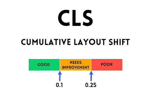
A high CLS score indicates a higher level of visual instability, while a low score represents a smoother user experience.

Google PageSpeed Insights is a tool to measure your website’s CLS.
Strategies to Improve Cumulative Layout Shift (CLS)
- Preload and Reserve Space
Identify the resources, such as images, videos, or scripts, that are causing layout shifts. Use browser developer tools or performance monitoring tools to identify the elements causing the CLS. Then, preload and reserve space for such resources as explained below.
Preload
Preloading allows you to fetch resources in advance, reducing the delay when needed. Add the preload attribute to the HTML tag to instruct the browser to fetch the resource early
e.g. <link rel=”preload” href=”path/to/resource” as=”type”>
Where type is the appropriate resource type, such as “image,” “video,” or “script,” and the path is the actual path to the resource.
Reserve Space
One common cause of layout shifts is the delayed rendering of content. To prevent this, reserve space for content elements before they are loaded. Use CSS to set explicit dimensions (width and height) or aspect ratios for images and videos. This ensures that the space required for these elements is allocated before loading them.
- Optimize Web Fonts
Web fonts can sometimes contribute to Cumulative Layout Shift (CLS) as they cause text to reflow when loaded.
The font-display property allows you to control how web fonts are displayed during the loading process. By default, most browsers use a behavior called “auto,” which can result in text reflow and CLS. To improve CLS, set the font-display property to a value that ensures the text is visible while the web font is loading. The recommended value for CLS optimization is “swap”, which displays the fallback font until the web font is loaded.
e.g.
@font-face {
font-family: ‘MyFont’;
src: url(‘path/to/font.woff2’) format(‘woff2’);
font-display: swap;
}
where “MyFont” is the actual font name and path is the directory path to the web font file.
When using web fonts, setting font sizes explicitly to avoid layout shifts caused by late font loading is essential. Specify font sizes in CSS using pixels (px) or another fixed unit instead of relying on relative units like percentages or ems, which can result in changes when the font is loaded.
For example, add the following CSS code to set a font size of 24 pixels for your H1s:
h1 {
font-size: 24px;
}
Optimize your font files by reducing their size without compromising quality. Tools like Font Squirrel, Transfonter, or FontForge can help you optimize font files by removing unnecessary data or converting them to more efficient formats like WOFF or WOFF2.
System fonts installed on users’ devices can render instantly, eliminating the need for loading web fonts. By specifying system fonts as the fallback option, you ensure that text is immediately visible while the web font is still loading. Use CSS to define a font stack with system fonts as the first option.
- Optimize Loading Order and Lazy Loading
Prioritize critical resource loading and load them before non-critical resources. Consider lazy loading of non-critical resources that are not immediately visible in the viewport.
- Delay Non-critical JavaScript Loading
Ordering the resource loading in your HTML or dynamically loading resources using JavaScript can be used to delay non-critical JavaScript loading
- Specify Image Dimensions
Specifying the image dimension can avoid layout shifts, thus providing you with better CLS values.
- Monitor Regularly
As CLS is for the lifespan of a webpage, you need to monitor it regularly and take necessary corrective action as and when required.
Continuously Analyze and Iterate
Improving Cumulative Layout Shift (CLS) is an ongoing process. As technology evolves and your website content changes, new elements might introduce layout shifts. Regularly analyze your website’s performance, gather user feedback, and use tools like browser developer tools and performance monitoring software to identify potential CLS issues. Keep track of any updates to third-party scripts, plugins, or widgets that you integrate into your website, as they can sometimes lead to unexpected layout shifts.
Implement Responsive Design
Responsive design plays a significant role in maintaining a positive user experience and minimizing layout shifts. Ensure that your website is designed to adapt seamlessly to different screen sizes and devices. Use media queries and responsive CSS techniques to optimize the layout and styling of your web pages for various viewport sizes. A well-executed responsive design can help prevent elements from shifting around as users switch between devices and orientations.
Consider Mobile-First Design
Given the prevalence of mobile browsing, it’s essential to adopt a mobile-first design approach. Designing for mobile devices first ensures that your website’s layout is stable and optimized for smaller screens. This approach encourages prioritizing essential content and avoiding excessive use of large images or heavy scripts that could contribute to layout shifts on mobile devices.
Regularly Update Third-Party Resources
Third-party resources, such as ads, social media widgets, and analytics scripts, can impact your website’s performance and contribute to layout shifts. Whenever possible, choose well-optimized and reputable third-party services. Regularly update their code snippets to the latest versions to take advantage of performance improvements and bug fixes that could indirectly affect your website’s CLS.
Optimize Videos and Embeds
Videos and embedded content, such as iframes from YouTube or social media platforms, can trigger layout shifts if not managed correctly. Use responsive embed codes that maintain a fixed aspect ratio, preventing sudden shifts when the content loads. If the embedded content has variable dimensions, consider using placeholders or lazy loading techniques to reserve space until the actual content is loaded.
Collaborate with Developers, Designers, and SEO Experts
Improving Cumulative Layout Shift requires collaboration between different teams. Developers, designers, and SEO experts should work together to ensure that the website’s technical aspects, visual elements, and optimization strategies are aligned. Regular communication can help identify potential CLS issues early in the development process and implement effective solutions.
Stay Informed About Web Standards
As the web evolves, new techniques, standards, and best practices emerge to improve user experience. Stay informed about updates to web standards and guidelines, such as those provided by the World Wide Web Consortium (W3C) and search engines like Google. By staying up-to-date with industry trends and recommendations, you can ensure that your website continues to meet evolving user expectations.
Conclusion
Users expect web pages to load smoothly and consistently without any unexpected layout shifts. Cumulative Layout Shift (CLS) is a vital metric that directly impacts the user experience of a website. By understanding the concept of CLS and implementing strategies to improve it, website developers and designers can create a more user-friendly online environment.
